Overview
The Foreign Language Center (FLC) at Ohio State University utilizes emerging technologies to encourage cross-cultural dialogue. I was tasked with redesigning the FLC website, which played a vital role in articulating the organization’s mission and providing valuable information to students, faculty, and staff.
Project involvement: Coding, prototyping, user research, and visual design
The Problem
At the onset of the project, the clients did not provide me with any specific information about what needed to change about the existing site.
The High-Level Goals
In the absence of a clear problem statement, I used analytical user research techniques (cognitive walk-troughs and heuristic analysis) to evaluate the site. Here is what I found:
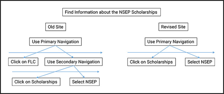
1. It was possible to reduce the number of clicks required to get to the relevant information.
2. The site lacked a clear information hierarchy.
3. The visual design was low-contrast and low-key, which made the site less captivating.
4. The site did not communicate the presence of a thriving, multi-cultural community.
2. The site lacked a clear information hierarchy.
3. The visual design was low-contrast and low-key, which made the site less captivating.
4. The site did not communicate the presence of a thriving, multi-cultural community.
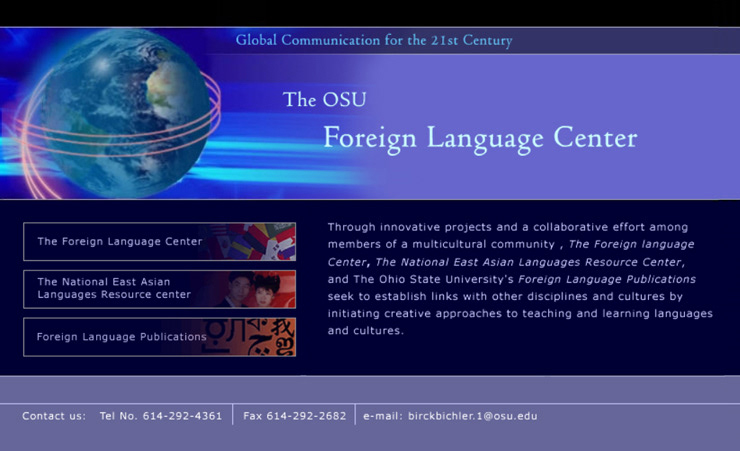
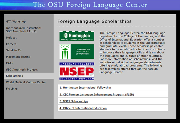
The Existing Site
Target Audience
The target audience belonged to three main groups:
1. The current student population
2. Prospective students
3. Faculty
1. The current student population
2. Prospective students
3. Faculty
Process
I conducted eight Interviews with faculty, staff, and students, inquiring about how they used the existing site. The interviews provided crucial information about how frequently they used the site and for what. Next, I chose some of the crucial tasks (e.g. find information about the NSEP scholarships) and asked five participants to use the site to complete the chosen tasks. I encouraged the participants to think out loud as they interacted with the site. Juxtaposing what people said with what they did provided valuable insights into what needed to be done to design a better site.
Insights from the Field
The FLC nurtured multiculturalism, and yet, the existing site did not represent cultural diversity.
The FLC staff and faculty utilized technology extensively in the classroom. However, the visual design of the existing site did not represent the ethos of the technological age.
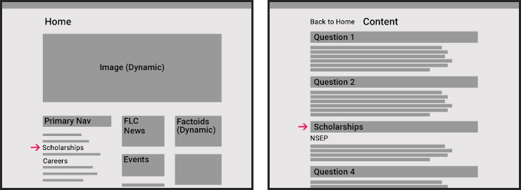
The existing site served as a gateway to three organizations–The FLC, The National East Asian Languages Resource Center, and Foreign Language Publications. I was informed that the new site had to represent the FLC alone, which changed the information architecture of the site (as seen below).
Revised goals
The new site must:
1. Allow people to retrieve information with fewer clicks.
2. Represent cultural diversity.
3. Appeal to the younger generation.
4. Provide information about the events taking place at the Foreign Language Center.
5. Give people a reason to return to the page by providing useful and thought-provoking information.
6. Provide information in an informal, conversational manner.
7. Have a clear information hierarchy.
Revisions
Cognitive walk-through
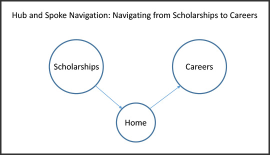
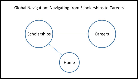
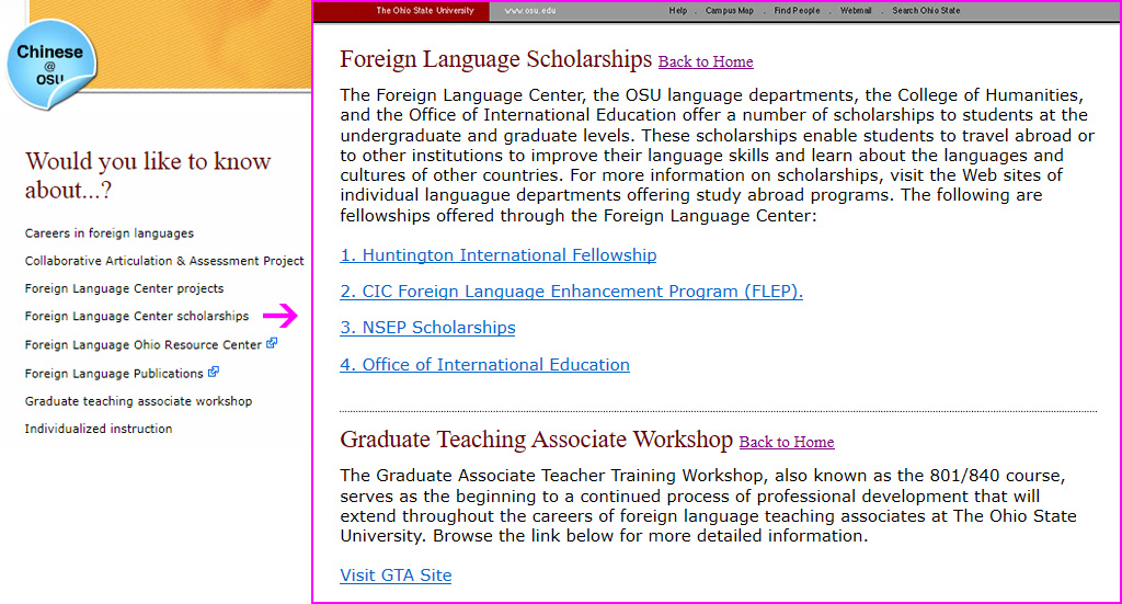
Based on the revised cognitive walk-through, I presented the clients with two different navigational schemes—hub and spoke and global navigation. After considering the amount of information present on each page, we decided to place all of the content on a single web page with a "back to home" link. In other words, we favored hub and spoke over global navigation.
Low-fidelity wire-frames (hub and spoke navigation)
Alternative wire-frames (global navigation)
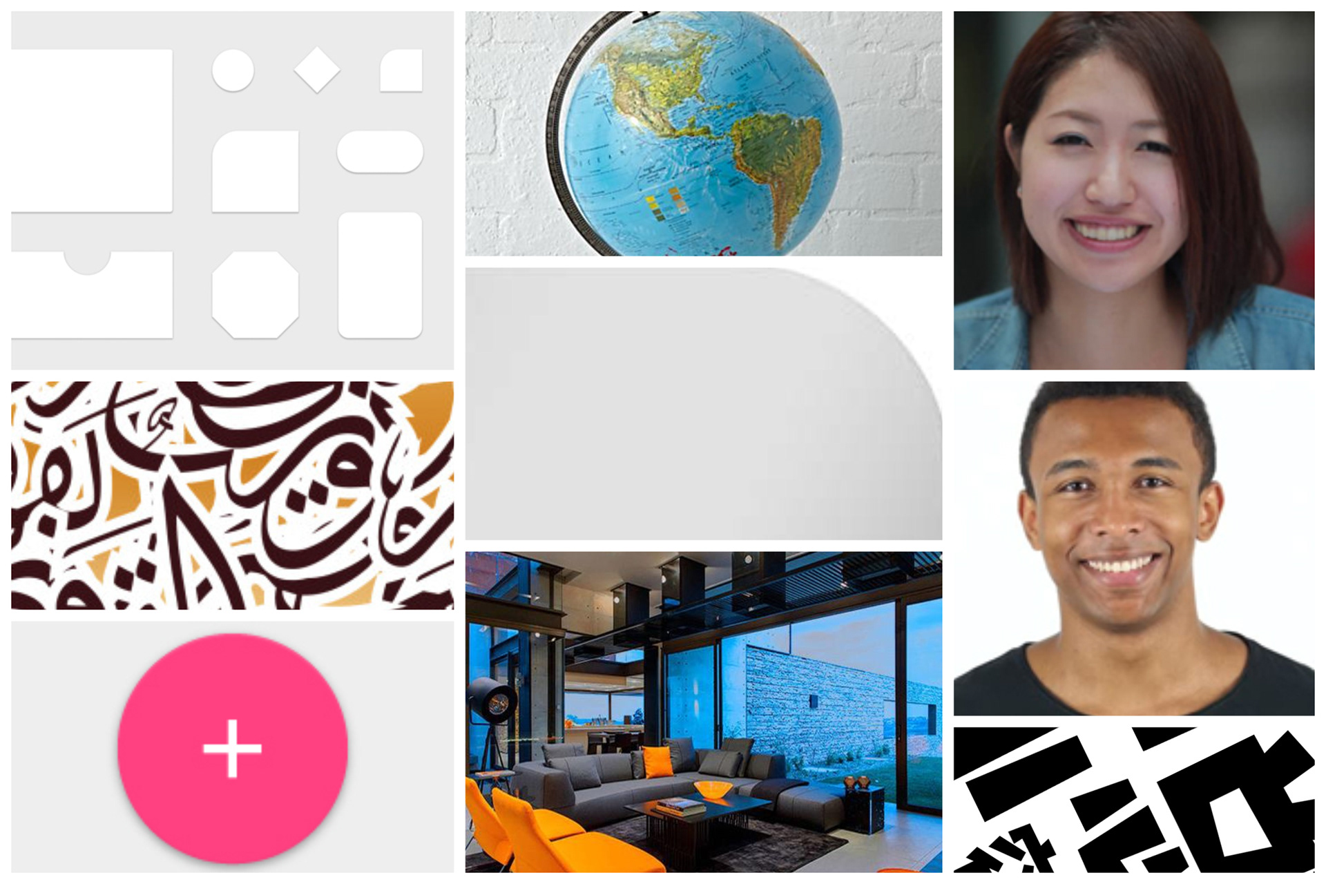
Mood board
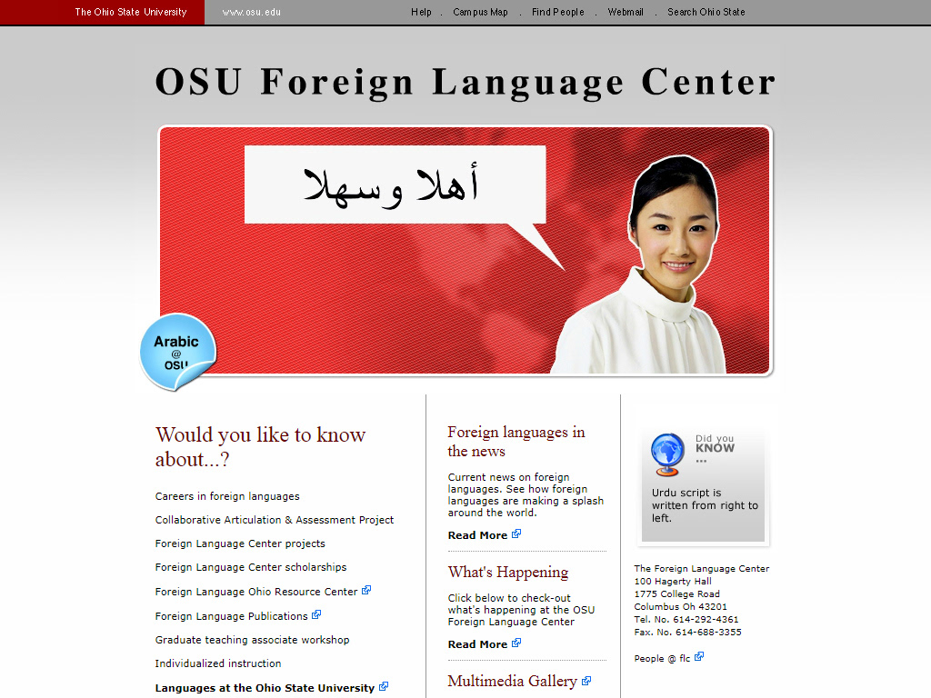
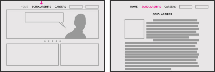
Final design
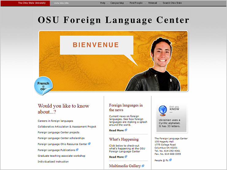
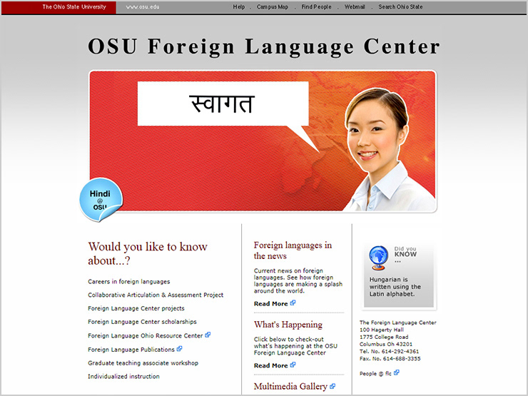
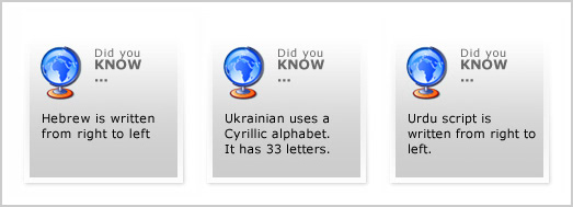
Each time a person visited the site, they received a new piece of information about language and culture (as seen below)
Reflection
Supporting a focused exploration of the site using the hub and spoke method while allowing people to interact with the peripheral elements (e.g., the factoids) appears to create a rewarding user experience. It is possible that because the human perception supports both focused (foveal) and peripheral scanning of the world, combining the two strategies mentioned above provides a more satisfying user experience.